

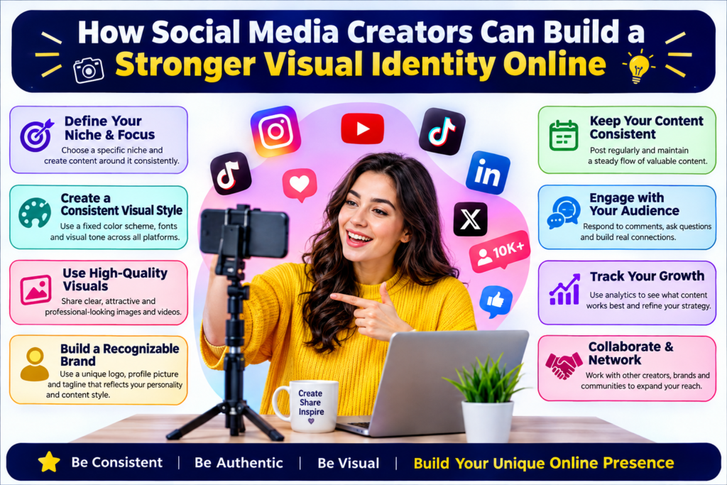
Social media has turned personal branding into something anyone can build. Actors, influencers, entrepreneurs, and business owners use the same platforms to present their work and personality. Audiences scroll quickly and often decide within seconds whether someone looks credible or worth following.
A strong visual identity helps creators become recognizable without making every post identical. It combines consistent choices in photography, colors, typography, and editing. The goal is creating a style that feels intentional and memorable.
Start With a Clear Personal Style
Before choosing filters or templates, creators should decide what they want their profile to communicate. A fitness coach may prefer energetic images and bold layouts, while a fashion influencer might use softer photography and minimal graphics. A technology creator could choose clean backgrounds and modern typography.
When viewers see several posts together, they should feel they belong to the same person or brand. This does not mean using one color forever. It means repeating enough visual elements to create familiarity.
Creators can begin by selecting a small color palette, two or three fonts, and a general photography style. These choices provide direction when producing future content and reduce the time spent deciding how every new post should look.
Make Profile Photos Easy to Recognize
The profile picture is one of the smallest images on a social platform, but it carries a surprising amount of importance. It appears beside comments, messages, search results, and recommendations. Because it is displayed at a tiny size, complicated photographs often lose impact.
A portrait with good lighting and a simple composition normally works better. The face should be visible, and objects should not compete for attention. Creators who need a cleaner portrait can use an editing feature to remove background elements and replace them with a simple setting that matches their brand.
The same image can be adapted for professional networks, media kits, speaker profiles, and collaboration proposals, creating a consistent identity across platforms.
Create Consistency Without Making Content Boring
Consistency is useful, but repetition can make a feed feel mechanical. Strong personal brands maintain recognizable elements while allowing enough variation to keep the audience interested.
One post might feature a portrait, another a short video, and the next a text-based tip. The formats can change while colors, fonts, editing choices, or tone remain familiar. This balance makes a profile feel organized without turning it into a rigid template.
Creators should also consider the purpose of each platform. An image that works well on Instagram may need a different crop for YouTube, LinkedIn, or TikTok. Designing with multiple formats in mind makes it easier to reuse content without sacrificing quality.
Use Better Lighting Before Relying on Editing
Editing software can improve an image, but it cannot always rescue a poorly captured photograph. Good lighting remains one of the simplest ways to improve visual content.
Natural window light is often enough for portraits, product photos, and casual videos. Facing the light usually produces a cleaner result than standing directly under a strong ceiling lamp. Creators should also check what appears behind them before recording.
Simple preparation reduces the amount of editing needed later. Cleaning the camera lens, choosing a tidy location, and checking framing can make smartphone content look noticeably more professional without expensive equipment.
For video, clear audio matters just as much as visual quality. Audiences may tolerate an imperfect image, but they often leave quickly when speech is difficult to understand.
Build Templates for Repeated Content
Many creators regularly publish similar formats, such as quotes, announcements, tutorials, reviews, or question-and-answer posts. Creating reusable templates can make these posts faster to produce while strengthening visual consistency.
A template should include recurring elements such as font choices, spacing, logo placement, and headline styles. However, it should remain flexible enough for different images and amounts of text.
Templates are especially helpful when several people manage the same account. Instead of guessing how something should look, each team member can follow an established visual system. This reduces mistakes and helps maintain a recognizable brand even as posting frequency increases.
Organizing finished templates and original files in clearly named folders also saves time. Creators can quickly find previous assets, update them, and avoid recreating designs from the beginning.
Let Personality Remain the Main Attraction
A polished profile can attract attention, but visual design should support personality rather than replace it. Followers usually connect with creators because of their knowledge, humor, perspective, talent, or story.
Perfectly coordinated posts can feel distant if they show nothing authentic. Behind-the-scenes moments, casual photos, personal observations, and spontaneous videos can make a carefully designed profile feel more human.
The strongest visual identity is therefore not necessarily the most elaborate one. It is the one that makes someone recognizable while leaving enough room for their personality to evolve.
Social platforms and design trends will continue changing, but clarity and consistency remain useful principles. Creators who understand what they want to communicate can make smarter visual choices, produce content more efficiently, and build an online presence that audiences recognize for the right reasons.